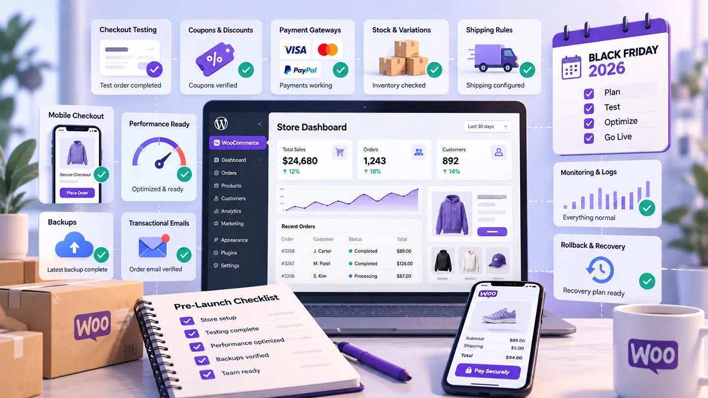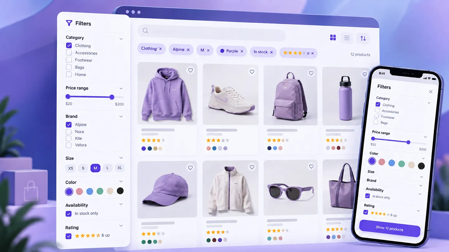
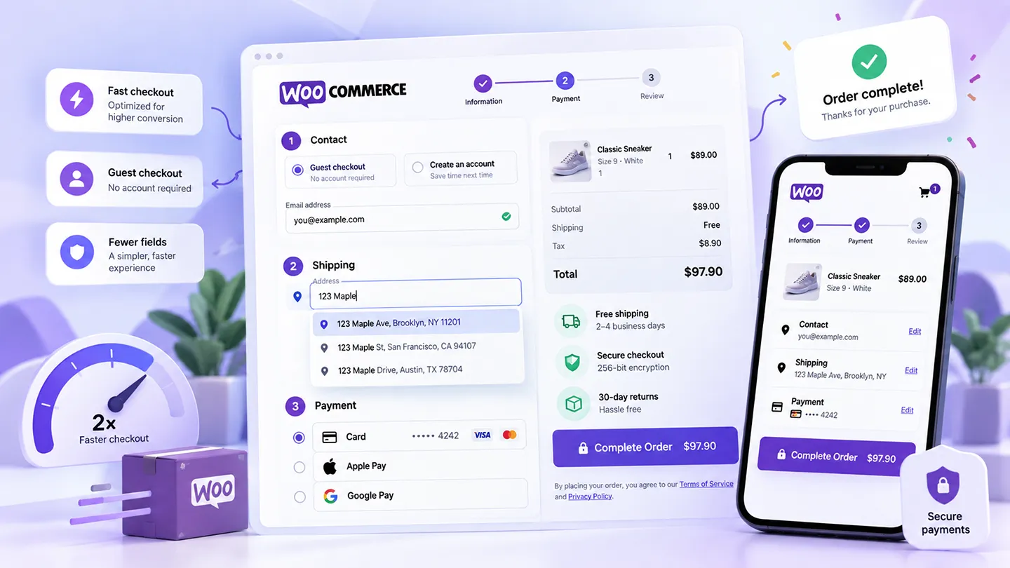
WooCommerce checkout optimization is often presented as a collection of tricks.
Remove the header. Add trust badges. Make the button brighter. Turn the checkout into one step. Add an order bump. Add urgency. Install a funnel plugin.
Some of those changes can help in the right store.
But they are not where we would start.
For most WooCommerce stores, the biggest checkout improvements are much less dramatic:
- let customers buy without unnecessary account friction,
- ask only for information the order actually needs,
- make address entry easier,
- show the payment methods customers expect,
- make errors understandable,
- keep the mobile experience clean,
- avoid surprises in shipping and total cost,
- remove slow or fragile integrations from the critical path.
The objective is not to make checkout look "optimized."
It is to make it easy to complete correctly.
That distinction matters because a checkout can look extremely polished while still creating friction through required fields, confusing validation, missing wallets, slow shipping calculations, or a payment method that fails on mobile.
In 2026, WooCommerce also has two checkout architectures in active use: Checkout Blocks and Classic Checkout. The architecture matters for compatibility and customization, but neither one automatically produces a higher conversion rate.
We covered that distinction separately in WooCommerce Checkout Blocks vs Classic Checkout in 2026.
This guide focuses on the customer experience instead:
What would we actually change first if the goal were to improve checkout completion?
Last researched: 7 October 2026.
The Short Version
| Checkout issue | What we would do first |
|---|---|
| Customers must create an account | Enable guest checkout where the business model allows it |
| Checkout feels long | Remove or make optional every field that is not operationally required |
| Address errors are common | Improve address entry and consider autocomplete |
| Mobile completion is weak | Test the full flow on real phones, not only responsive preview |
| Payment abandonment is high | Offer the payment methods customers actually use, including wallets where appropriate |
| Shipping/tax surprises appear late | Make costs and delivery expectations visible as early as practical |
| Customers hit confusing errors | Use specific validation and preserve entered data |
| Checkout is slow | Profile payment, shipping, tax, analytics, and third-party requests |
| Store uses many old customizations | Audit them before changing checkout architecture |
| Someone suggests "one-step checkout" | Test the complete experience, not the number of visual steps |
If we had to reduce the whole article to one rule, it would be this:
Remove uncertainty and unnecessary work before adding more checkout features.
1. Make Guest Checkout Easy
For normal one-off purchases, forcing account creation is one of the easiest ways to add friction.
WooCommerce already gives merchants control over this in WooCommerce → Settings → Accounts & Privacy.
Current WooCommerce settings allow stores to:
- enable guest checkout,
- allow login during checkout,
- offer account creation during checkout,
- offer account creation after checkout.
The last option is particularly interesting.
If the store does not genuinely need an account before payment, letting the customer complete the order first and create an account afterward can keep registration out of the purchase path.
Baymard's current checkout research continues to identify forced account creation as a meaningful abandonment reason. Its 2026 abandonment research reports that 19% of surveyed shoppers abandoned a checkout because they were forced to create an account.
See: Baymard's current cart-abandonment research.
Do not hide guest checkout
Technically supporting guest checkout is not enough if the option is visually secondary or difficult to understand.
If customers are confronted first with:
- Sign in,
- Create an account,
- Reset password,
and "Continue as guest" appears as a small text link below them, the store has still made account creation feel mandatory.
The customer should understand immediately that an account is optional.
There are legitimate exceptions
Not every WooCommerce product can or should be sold as a guest.
WooCommerce's current Accounts and Privacy documentation notes that customers purchasing subscriptions need an account.
Memberships, account-bound downloads, B2B purchasing, licensing systems, customer portals, and other workflows can also make an account operationally important.
In those situations, the optimization is not "remove accounts."
It is:
- explain why the account is required,
- minimize the registration work,
- avoid asking for information twice,
- make password setup and recovery painless.
The right checkout removes unnecessary account friction without breaking the business model.
2. Remove Fields Before You Redesign the Page
A checkout with too many fields feels expensive before the customer has paid anything.
Every field introduces another opportunity to:
- hesitate,
- type something incorrectly,
- trigger validation,
- wonder why the store needs the information,
- abandon on mobile because the form feels endless.
Baymard's current checkout research reports that checkout complexity remains a measurable abandonment reason and that many ecommerce sites still expose substantially more form elements than an efficient checkout requires.
See: Reasons for Cart Abandonment – 2026 data.
For WooCommerce, we would start by reviewing fields one by one.
Company name
Does a consumer store need it?
If not, remove it or make it optional.
Address Line 2
This can be useful, but it usually should not look as important as Address Line 1.
The current WooCommerce Checkout Block lets merchants control the visibility of fields including Company, Address Line 2, and Phone.
Phone number
Do fulfillment, delivery, fraud prevention, or customer support genuinely require it?
If yes, keep it.
If not, do not collect it by default merely because WooCommerce has historically displayed a phone field.
If the phone number is required, explain why when that reason is not obvious.
Custom fields
This is where checkout forms often grow over time.
A store adds:
- VAT number,
- delivery instructions,
- marketing source,
- purchase order number,
- gift information,
- preferred delivery date,
- extra consent,
- business department,
- internal reference.
Each field can have a valid purpose.
The problem is when every useful piece of information becomes mandatory for every customer.
Ask:
Does this information have to be collected before payment?
Some data can be collected:
- only for specific products,
- only for B2B customers,
- after the order,
- inside My Account,
- in fulfillment communication,
- as an optional field.
Modern Checkout Blocks also provide a structured additional-checkout-fields API for extensions, with field locations for contact, address, and order information.
That makes custom fields easier to integrate consistently, but it does not mean more fields are better.
3. Make Address Entry Easier
Address entry is one of the most tedious parts of ecommerce checkout, especially on a phone.
A customer may need to enter:
- country,
- first and last name,
- street,
- apartment/unit,
- city,
- state or province,
- postcode,
- phone.
That is a lot of typing for information that often already exists in structured address databases.
Address autocomplete can reduce work
A well-implemented address-autocomplete system can let the customer begin typing an address, select the correct suggestion, and populate the remaining address fields automatically.
Baymard's checkout guidance specifically identifies address lookup and browser autofill as useful ways to reduce address-entry friction.
See: Baymard's Checkout Flow UX guide.
WooCommerce's ecosystem now has multiple ways to add address autocomplete. WooPayments also provides an address-autocomplete option on supported setups, and dedicated checkout/address extensions can provide similar functionality.
The feature is useful when it:
- returns relevant local addresses,
- maps street/city/state/postcode correctly,
- respects the customer's country,
- still allows manual correction,
- works reliably on mobile,
- does not block checkout if the lookup service is unavailable.
Autocomplete should assist, not trap
Address tools become a problem when the customer cannot enter a legitimate address because the autocomplete provider does not recognize it.
Manual entry should remain possible.
This matters for:
- new developments,
- rural addresses,
- apartment formatting,
- military addresses,
- unusual regional formats,
- countries with incomplete provider coverage.
We would treat autocomplete as a faster input method, not as the authority that decides whether a customer's address exists.
4. Show the Right Payment Methods — Not Every Payment Method
Payment choice affects conversion, but adding ten gateways is not automatically better than adding two.
The aim is to cover the payment methods customers genuinely expect.
For many stores that means a combination such as:
- cards,
- Apple Pay,
- Google Pay,
- Link or another accelerated checkout,
- PayPal where customer demand justifies it,
- important regional methods,
- BNPL only when it makes sense for the product and audience.
Our Best WooCommerce Payment Plugins in 2026 guide covers the gateway decision in more detail.
Wallets matter because they reduce data entry
Apple Pay and Google Pay are not only alternative payment brands.
On supported devices, they can reduce how much payment and address information the customer has to type manually.
That is particularly valuable on mobile.
But express payment buttons should be tested in the real checkout.
Check:
- product variations,
- shipping selection,
- coupons,
- taxes,
- required custom fields,
- subscriptions,
- saved payment methods,
- guest orders,
- mobile browsers.
A wallet button that bypasses information the business genuinely needs is not an optimization.
Keep the payment decision understandable
More choices can also create noise.
If a customer sees:
- four visually similar card options,
- multiple pay-later products,
- several wallets,
- a bank transfer option,
- cash on delivery,
- PayPal,
- regional methods,
the payment section can become harder to scan.
We would rather show a small, relevant payment stack than every gateway an extension can technically enable.
5. Do Not Surprise Customers With the Final Cost
Checkout is a bad place for a customer to discover that the order is materially more expensive than expected.
Baymard's 2026 abandonment data identifies additional costs such as shipping and taxes as one of the largest reported reasons for abandonment.
The exact point where shipping and tax can be calculated depends on:
- customer location,
- product type,
- shipping zones,
- carrier rates,
- tax rules,
- whether the customer is logged in.
But the principle is still useful:
Show cost information as early and as clearly as the store reasonably can.
That can mean:
- clear shipping thresholds,
- estimated shipping before checkout,
- delivery-cost calculators,
- transparent tax messaging,
- no unexpected handling fees,
- clearly displayed recurring totals for subscriptions.
If the store offers free shipping above a threshold, make the threshold visible before checkout.
If a surcharge applies to a particular payment or delivery method, do not hide it until the final click.
Checkout optimization is partly about speed.
It is also about avoiding unpleasant surprises.
6. Optimize for Mobile as the Primary Checkout
A checkout that works in a desktop browser at 1440px is not necessarily a good checkout.
Real mobile checkout adds:
- a software keyboard,
- less visible context,
- browser UI consuming screen space,
- autofill overlays,
- wallet sheets,
- slower connections,
- accidental taps,
- scrolling between errors and fields.
We would test on actual phones.
Things we look for immediately
- Are input fields large enough to use comfortably?
- Does the correct keyboard appear for email, phone, postcode, and numeric fields?
- Does browser autofill work?
- Does the sticky browser UI cover important buttons?
- Are validation messages visible near the actual problem?
- Does opening a payment method cause layout jumps?
- Can the customer review totals without excessive scrolling?
- Are Apple Pay / Google Pay buttons displayed correctly?
- Do postcode/state updates trigger slow or confusing refreshes?
- Does the Place Order button remain clear after errors?
A desktop-first checkout with responsive CSS can still fail these tests.
Avoid unnecessary visual density
Checkout is not a product landing page.
We generally want:
- clear hierarchy,
- readable labels,
- comfortable spacing,
- visible totals,
- obvious primary action,
- minimal distraction.
This does not mean stripping every header, footer, help link, or navigation element from every store.
It means the checkout should have one dominant task: finishing the order.
7. Error Handling Is Part of Conversion Optimization
Customers will make mistakes.
Cards will fail.
Addresses will be incomplete.
Postcodes will not match.
Coupons will expire.
Shipping methods will disappear after an address change.
A checkout is not optimized because errors never occur.
It is optimized when customers can recover from errors without losing confidence or re-entering information.
Good checkout errors answer three questions
- What went wrong?
- Where is the problem?
- What should I do next?
"An error occurred" answers none of them.
"Card declined — try another payment method or contact your card issuer" is more useful.
"Enter a valid postcode for the selected state" is better than sending the customer back to the top of the form.
Preserve entered data
Few checkout failures are more frustrating than fixing one problem and discovering that another part of the form has been cleared.
Test:
- payment declines,
- invalid coupons,
- missing required fields,
- address changes,
- shipping recalculation,
- expired sessions,
- failed API calls.
The customer should not have to rebuild the order because one step failed.
Baymard's current checkout benchmark specifically emphasizes adaptive, issue-specific error messages rather than generic validation.
See: Checkout UX 2025: 10 Pitfalls and Best Practices.
8. Checkout Speed Is More Than a Lighthouse Score
A fast product page and a slow checkout can coexist.
Checkout often performs work that normal pages do not:
- calculate shipping,
- calculate tax,
- call payment APIs,
- update totals,
- validate addresses,
- load fraud tools,
- load wallets,
- fire analytics,
- communicate with subscription or membership extensions,
- refresh blocks or fragments.
That means checkout performance needs to be measured as a workflow.
What we would profile
Look at:
- initial checkout load,
- time to update after address changes,
- shipping-rate API response time,
- tax-service response time,
- payment-method initialization,
- Store API requests on Checkout Blocks,
- AJAX requests on Classic Checkout,
- third-party JavaScript,
- tag-manager scripts,
- fraud and tracking tools.
A checkout can have a respectable Lighthouse score and still feel slow if changing the postcode freezes totals for four seconds.
Be careful with aggressive caching
Checkout is dynamic.
Cart, customer, shipping, tax, nonce, payment, and session data can all make full-page caching inappropriate.
Performance optimization here is usually about:
- efficient hosting,
- database health,
- reducing unnecessary plugins,
- eliminating duplicate scripts,
- improving slow external calls,
- using current WooCommerce-compatible caching rules.
Do not "optimize" checkout by caching personalized or transactional data incorrectly.
9. Do Not Assume One-Step Checkout Converts Better
"One-page checkout" sounds automatically faster.
Sometimes it is.
Sometimes it simply puts every field, shipping option, payment method, order total, coupon, login form, and upsell on one enormous page.
The meaningful metric is not the number of steps.
It is the amount of work and uncertainty.
A multi-section checkout can feel simple when:
- each section is short,
- progress is obvious,
- information is preserved,
- the next action is clear.
A one-page checkout can feel difficult when it is visually dense.
The current WooCommerce Checkout Block even provides a Form Step Options setting that can add numbering to checkout sections and create a more guided flow.
The best layout depends on the store.
If you are evaluating checkout-replacement or funnel plugins, our Best WooCommerce Checkout Plugins in 2026 guide compares the broader approaches.
But we would not buy a checkout plugin solely because its marketing says "one step."
Test the completed experience.
10. Blocks vs Classic: Choose Compatibility First
Checkout optimization frequently turns into a Checkout Blocks vs Classic Checkout discussion.
We think that is backwards.
Choose the architecture that can reliably support the store's required checkout.
For a new store in 2026, Checkout Blocks are normally our starting point.
For a mature store with years of custom PHP hooks, specialized fields, gateway logic, or theme overrides, migrating can require more work.
Neither architecture guarantees better conversion.
What matters to conversion is what the customer actually experiences:
- field count,
- speed,
- errors,
- payment availability,
- clarity,
- mobile behavior,
- trust,
- total cost.
We would rather run a stable Classic Checkout than a modern Checkout Block with a broken payment or shipping integration.
Likewise, we would not keep Classic Checkout indefinitely simply because "it still works" if the store is being rebuilt and all required integrations now support Blocks properly.
Architecture is an implementation decision.
Customer friction is the conversion problem.
11. Be Careful With "Trust" Improvements
Checkout is a high-anxiety page because the customer is about to:
- spend money,
- enter personal information,
- provide a payment method,
- trust the store to deliver.
Trust matters.
But trust is not the same as adding a row of generic badges.
A more credible checkout usually comes from basics such as:
- recognizable payment methods,
- HTTPS with no browser warnings,
- a professional and consistent design,
- clear business/contact information,
- transparent returns and shipping policies,
- accurate totals,
- no broken layout,
- no suspicious redirects,
- payment flows customers recognize.
Adding five security logos from companies the customer has never heard of can make the checkout look less trustworthy.
The same applies to fake scarcity and aggressive countdowns.
A checkout optimization should reduce hesitation, not manufacture anxiety.
12. Measure the Funnel Before and After Changes
"Conversion rate went up" is useful only if you know what changed and where.
At minimum, we would try to understand:
- sessions that reach cart,
- sessions that begin checkout,
- completed purchases,
- payment failures,
- checkout completion rate,
- mobile vs desktop completion,
- gateway distribution,
- coupon usage,
- shipping-method distribution.
Depending on the analytics setup, you may also be able to measure:
- abandonment by checkout stage,
- validation errors,
- time spent in checkout,
- repeated payment attempts,
- field interaction.
Change fewer things at once
If you simultaneously:
- install a new checkout plugin,
- remove fields,
- change the payment gateway,
- add Apple Pay,
- redesign the page,
- change shipping thresholds,
and conversion changes, you will not know why.
On stores with enough traffic, controlled testing is better.
On smaller stores, where A/B tests may take too long to reach useful sample sizes, make improvements based on clear usability problems and monitor operational metrics carefully.
Do not pretend statistical certainty where there is none.
What We Would Not Do First
If someone asked us to improve a normal WooCommerce checkout tomorrow, we would not begin with:
- a funnel builder,
- an order bump,
- a countdown timer,
- five trust badges,
- a complete checkout replacement,
- hiding every navigation element,
- custom CSS before auditing the workflow,
- adding more payment gateways,
- forcing account creation to "capture customers."
Those can all be separate business decisions.
They are not the fundamentals.
We would first ask:
- Can customers check out without unnecessary account friction?
- Which fields can disappear?
- Is address entry easy?
- Are shipping and totals predictable?
- Are the right payment methods available?
- Does checkout work well on a real phone?
- Are errors understandable?
- Is anything slow or fragile?
- Are extensions compatible with the chosen checkout architecture?
- Can we measure whether the change helped?
Only after that would we consider more elaborate conversion features.
A Practical WooCommerce Checkout Audit
Here is the checklist we would use before redesigning anything.
Accounts
- Guest checkout enabled where appropriate
- Login available but not obstructive
- Account creation delayed or simplified where possible
- Subscription/account requirements clearly explained
Fields
- Company field justified
- Phone field justified
- Address Line 2 treated appropriately
- Custom fields audited
- Optional fields clearly optional
- No duplicate information requests
Address and shipping
- Browser autofill works
- Address autocomplete tested if used
- Manual address entry remains possible
- Shipping rates update reliably
- Delivery expectations are clear
- No unexplained fees appear at the end
Payments
- Primary card gateway tested
- Apple Pay / Google Pay tested where enabled
- PayPal/local methods included only when useful
- Payment errors are understandable
- Saved payment methods work
- Subscription flows tested when relevant
Mobile
- Tested on real iPhone and Android devices where practical
- Input types trigger useful keyboards
- Autofill works
- No horizontal overflow
- Buttons remain visible and tappable
- Wallet sheets and redirects return correctly
Performance
- Initial checkout load is acceptable
- Address updates do not stall
- Shipping/tax calls are responsive
- Third-party scripts audited
- No duplicate analytics/payment scripts
- Checkout excluded from unsafe page caching
Recovery
- Validation points to the correct field
- Entered data survives errors
- Failed payments can be retried
- Coupon failures explain the problem
- Customers are not sent through unnecessary loops
The Order We Would Optimize an Existing Store
For an established WooCommerce store, we would normally work in this order.
1. Fix anything broken
Payment failures, missing shipping methods, mobile bugs, JavaScript errors, validation loops, and incorrect totals come before visual optimization.
2. Remove unnecessary friction
Enable appropriate guest checkout, reduce fields, improve labels, and simplify custom requirements.
3. Improve data entry
Make autofill work properly and consider address autocomplete where it solves a real problem.
4. Improve payment coverage
Add wallets or relevant regional methods when customer behavior supports them.
5. Profile performance
Find the actual slow operations rather than installing a generic "speed" plugin.
6. Improve visual hierarchy
Once the workflow is sound, refine layout, spacing, order summary, buttons, and responsive behavior.
7. Test larger architectural changes
Only then would we consider a complete checkout replacement, funnel system, or migration motivated specifically by checkout UX.
This order is intentionally boring.
That is usually a good property for checkout engineering.
Final Take
WooCommerce checkout optimization in 2026 is not about finding one plugin or one layout that "converts best."
The strongest checkout is usually the one that asks the customer to do the least unnecessary work while preserving everything the business genuinely needs.
For most stores, we would prioritize:
- guest checkout where appropriate,
- fewer fields,
- easier address entry,
- relevant payment methods and wallets,
- clear shipping and totals,
- excellent mobile behavior,
- specific error recovery,
- fast, reliable checkout operations.
Checkout Blocks are a good modern starting point for new stores, but switching architectures is not itself a conversion strategy.
A one-page checkout is not automatically simpler.
More payment methods are not automatically better.
More "trust" elements do not automatically create trust.
The best checkout improvements are often the least glamorous ones:
remove a field, explain a cost, shorten an error, remember the customer's data, speed up a shipping request, or let someone pay with the wallet already on their phone.
Those changes do not make for exciting funnel screenshots.
They make it easier for customers to finish buying.